 |
| Beatriz Milhazes, Brinquelandia, 2008, mixed media collage on paper, 45 1/4" x 56 1/4" Image from James Cohan Gallery website |
Beatriz Milhazes is the contemporary artist I think of as the Queen of Color. The piece above is actually not that typical of her work in that it's pretty geometric, where her usual work contains swirls and arabesques in more rounded shapes. Click the gallery link in the caption above and you'll see 25 other examples of her work.
I picked this one because I wanted to show the use of text as texture and as a means for adding color. I believe that Milhazes uses a lot of food wrappers from candy or gum in her work. In your bricolage work, perhaps you could use pieces of fabric, paint chips, printed advertising or other sources to add color to your work in addition to paint.
 |
| Yayoi Kusama, Violet Obsession, 1994, sculpture of stuffed phallic forms in the shape of a rowboat and oars. Picture taken at MoMA in July 2010. |
 |
| Detail of the Kusama work |
Yayoi Kusama: Talk about saturated color! Here is an example of one hue used to cover a multitude of objects, unifying them and making an intense statement.
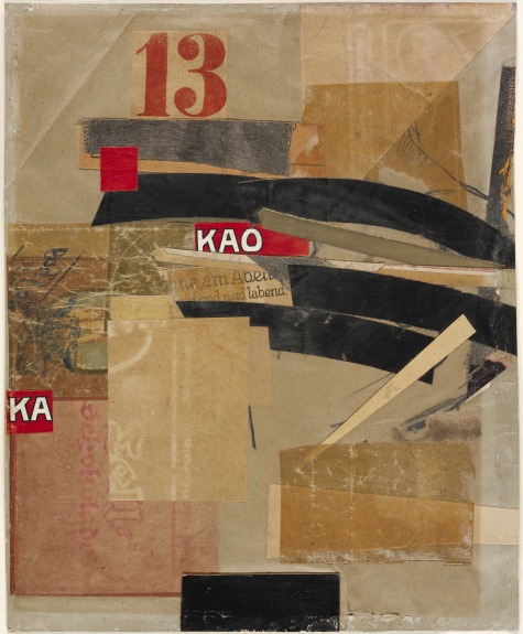 |
| Kurt Schwitters, MZ443 (untitled), image from the Menil Collection |
Kurt Schwitters: This work by an artist known principally for his collages illustrates how a limited amount of strong color can animate a composition. Note how the use of red brings out the pinkish paper at bottom left (may actually be the back of something red). Black is also an important color, used in the cut paper and in pencil lines.
 |
| Detail from Rebus by Robert Rauschenberg, 1955, mixed media on three panels, 8x10 feet x 11 1/8", picture taken at MoMA in July 2010. |
Robert Rauschenberg's daring use of 3D materials along with paint and canvas was the bridge between Abstract Expressionism and Pop Art. In Rebus he included 117 paint samples lined up between the two drippy reds at the bottom of this image. Here we see color from elements and color from paint, pencil, prints, newspaper, fabric and who knows what else.
 |
| Size in inches: 28"x 34 1/4" |
Conrad Marca-Relli: I saw an ad for the Knoedler show with a similar piece by Marca-Relli in the current Art News and it caught my eye. I like the way he uses those stripes and adds that unexpected pale blue piece of fabric above. I suppose he means it to represent the sky, but if so, why are those cloud shapes striped too? The only little piece of red (plus white and blue) really draws attention to itself, but the competition with the movement of the stripes is pretty severe. That black L-shape at mid to lower left anchors the block of smaller shapes and implies a shadow.
 |
| Conrad Marca-Relli, Cityscape A-M-11-96, 1996, collage and mixed media on canvas, 42" x 45 3/4" |
Here's another Marca-Relli with what appears to be a simple organization. The yellowish color at bottom looks like it comes from clasp envelopes. The middle section could be a deconstructed book and the black at the top could be anything but is probably paint. I really like the simplicity of this piece and the color is subtly very powerful. I think you can never go wrong with plenty of black, but that's just me.
 |
| Leonardo Drew, Untitled work. Picture taken at Sikkema Jenkins Gallery in February 2010. |
Leonardo Drew: One of my favorite artists, Drew uses a lot of black in his work. Here he paints single objects displayed in a grid constructed from old window trim. Note how painting some of the boxes themselves, as well as the objects, breaks up the grid a bit. Also some of the objects are more dimensional than others and some boxes are painted whiter or less brown than others. It gives the work a more organic look and softens the geometry.
 |
| Lee Bontecou, Untitled 1961, welded steel, canvas, wire and rope, 72 5/8" x 66" x 25 7/16", image from the website of the Whitney Museum |
Lee Bontecou, another of my faves, also used plenty of black in her early work. The color of the recycled canvas pieces in this one came from use (dirt) in their prior industrial life and from soot that she applied with her welding torch. The combination of the two sources gave the work a distinctive greyed-out taupe-ish color that combines beautifully with black as the color really all comes from the black scale.
 |
| Work by Brian Dickerson. Unfortunately, something is wrong with his website that won't allow me to look up the info on this individual work., but as I recall it, this is a good-sized piece, 40"-ish in size |
Brian Dickerson: Here's another work that uses a color with plenty of black in it. This is a taupe with a warm temperature (toward red) as compared with Bontecou's cool (toward green). I really like Dickerson's work, which is constructed with hidden enclosures and buried components. The freshness of that little piece of green in the midst of all that black and brown really brings the piece alive when highlighted by the white next to it. There is no question about the compositional focus being on the inset color, but what's that strange line of something inset to its left? Ah, mystery! (Here's another link to see Dickerson's work at Kouros Gallery in NYC this summer.) By the way, the list of materials in Dickerson's work says "oil, wax, mixed media on wood." I'm guessing the wax is cold wax mixed with oil paint, but I could be wrong.
 |
| Hannelore Baron, Untitled box construction, 1985, 14" x 8" x 2 1/2" |
Hannelore Baron: I am not sure what the objects in the box are, but the color that she has used on them is dark, rich and subtle in combination with that beautiful brown of the box. Whatever those vertical pieces are, they are being restrained by the rope and string and the viewer is being kept out of their intimate interior space. I am making the point here that dark color brings a richness and depth not found in bright, saturated color. My eye seems to go into the dark while light color stays on the surface.
 |
| Henry Klimowicz, Circles #3, 7 x 7 feet, cardboard and hot glue |
Henry Klimowicz is a master of cardboard. He makes huge and spectacular work using just this one material and hot glue. The color is all from the cardboard itself, but the shape of the elements influences the value because the light strikes it differently depending on size and shape. This is something else to consider when making a bricolage composition from one type of element, and a factor that's also apparent in the work of El Anatsui, for example. How much can you vary the color by varying size and shape of one type of element? More on Klimowicz's website.
 |
| Spectacular cardboard works from a Klimowicz exhibition |
 |
| Tara Donovan, Untitled, 2003, styrofoam cups and hot glue, 6x20x19 feet |
Tara Donovan: The master of works made from one element, Donovan adds no color to her works, but the way light hits the surfaces of the elements provides plenty of variety. Probably color is not the first thought you would have when looking at Donovan's work, but here is one more example of a repeating element using light as its palette. (Take a look at more of Donovan's work at the Boston ICA.)
 |
| Kathryn Frund, Rapture, Rupture #6, 16"x16", image from website of Chase Young Gallery, Boston |
Kathryn Frund: Here is more color from elements (natural wood) plus a thin layer of paint over the natural color of the crumpled and wrinkly metal. Slightly visible at left and bottom is more color from the panel underneath. This is subtle, mostly invisible color that still works its magic. (Click the link for the gallery to see Frund's usual much more colorful work.)
 |
| Catherine Nash, Reliquary to the Dawn, 2011, 14"x13"x5", mixed media assemblage with vintage drawer, encaustic, nautilus shell, antique market finds, raku-fired ceramics, lashed pine needles from the Gila Wilderness in New Mexico gathered at dawn |
Catherine Nash: This lovely piece gets its color from aged wood, rust, the soft tans of the pine needles with the darker bands of twine, and the luminescence of the shell. The highlight is the small encaustic painting with the pale turquoise and pinkish white of dawn's rosy glow. The 3D element of the shell plays an important role by providing the link in color and shape between the painting and the found elements. Notice that the found elements are not embedded in encaustic but left in their natural state and attached by other means to the drawer. (More of Catherine's work here and here. Studying Catherine's work will provide plenty of examples of how to combine encaustic with found elements.)
 |
| Sharon Booma, Nothing But a Rumor, 2011, 60"x60"x3", oil and mixed media on pan |
 |
| Sharon Booma, Unobstructed Effort, 2011, 48"x48"x3", oil and mixed media on panel |
 |
| Sharon Booma, Opportune Moment, 42"x42"x3", oil and mixed media on panel |
Sharon Booma: Finally, I'm showing you three by Sharon Booma to illustrate the use of strong allover color with elements both painted over and exposed in the color field. Booma is a master of this type of painting. Notice how she leaves plenty of empty space (color field) for the eye to rest in. Having elements submerged in the field or partially exposed by scraping adds a sense of discovery for the viewer. Imagine how blah these works would be if they were painted only with unpigmented medium. Also notice that while there is a predominant color, there are also many other colors included in each work. These colors could be added with mediums other than encaustic or come from the elements themselves. (Note that if you are coming or going through Boston to or from the conference, Booma shows at Arden Gallery on Newbury Street, where you can also see work by Joanne Mattera, Kim Bernard and me).
I hope that this post will give you more ideas for your work and add some possibilities for bricolage that you may not have considered previously. I'm looking forward to meeting everyone at the conference and working with you in the post-con workshop(s). The mystery boxes are being assembled and will be waiting for you to reveal their contents.
Love the work of Brian Dickerson, if you find anything more on his website please post, also particularly love the work by Kathryn Frund and all of the pieces by Sharon Booma. Thank you for the rich vusual start to my day.
ReplyDeleteThanks for introducing me to some new artists, particularly like Sharon Booma's work.
ReplyDeleteThank you, Nancy, for a very good post. Arden sure has powerful artists! See you in a few days with weather looking perfect.
ReplyDeleteThanks for your comments, Kate, Carrie and Hylla. I'm glad you enjoyed the post.
ReplyDeleteHylla - See you there SOON!
Love the work of Brian Dickerson.
ReplyDeletejust found your blog searching one of the artists on this page - you have a great eye - thanks for reminding me about Marca-Relli!! Also, the blue in Sharon Booma's piece is unreal...Well, that was the inspiration I needed - now it's back to the studio for me...
ReplyDeleteI found your blog today via a Pinterest link and enjoyed this post! I haven't heard of many of these artists and I love mixed media/assemblage so it was enlightening. Looking forward to exploring your other posts.
ReplyDelete